Visualisation tools
- Resource collections and state of play surveys
- Application collections
- Specific applications
- Analysis
See also:
Resource collections and state of play surveys
Visualisation tools resource list, Anthony Judge and Nadia McLaren (2006)
Resources on:
- mind mapping
- concept mapping
- network visualization
- text analysis/theme abstracting
Resources, Visualcomplexity.com, Manuel Lima
Resources on:
- graph drawing
- networks
- information Visualization
Review of Visualization in the Social Sciences: A State of the Art Survey and Report, Scott Orford, Daniel Dorling, Richard Harris, School of Geographical Sciences, University of Bristol Report for the Advisory Group on Computer Graphics, Final Report, 27 July 1998.
Application collections
Visualcomplexity.com, Manuel Lima
VisualComplexity.com intends to be a unified resource space for anyone interested in the visualization of complex networks. The project’s main goal is to leverage a critical understanding of different visualization methods, across a series of disciplines, as diverse as Biology, Social Networks or the World Wide Web. I truly hope this space can inspire, motivate and enlighten any person doing research on this field. Not all projects shown here are genuine complex networks, in the sense that they aren’t necessarily at the edge of chaos, or show an irregular and systematic degree of connectivity. However, the projects that apparently skip this class were chosen for two important reasons. They either provide advancement in terms of visual depiction techniques/methods or show conceptual uniqueness and originality in the choice of a subject. Nevertheless, all projects have one trait in common: the whole is always more than the sum of its parts.
Categories:
Art (44)
Biology (42)
Business Networks (21)
Computer Systems (25)
Food Webs (7)
Internet (28)
Knowledge Networks (111)
Multi-Domain Representation (52)
Music (22)
Others (42)
Pattern Recognition (19)
Political Networks (14)
Social Networks (70)
Transportation Networks (31)
World Wide Web (48)Data Visualization
Tree Maps
Heat Maps
Interaction Design
Geo-Mapping
Specific applications
The Climate Policy Labyrinth Info-Mural, Robert Horn.
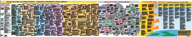
[Original image (PDF, 1 Mb)]
What this info-mural shows. This info-mural synthesises visually a number of interviews with senior UK civil servants and outside experts about the challenges of dealing effectively with the issues of energy security and climate change through to 2050. It metaphorically displays the constraints expressed by the interviewees as a huge labyrinth – and the uncertainties as a huge cloud — through which policies must proceed in order to result in the possible good outcomes identified (on which there was substantial agreement). It also depicts the enabling conditions interviewees identified as supportive of achieving the good outcomes. Overall it seeks to mirror the view of the policy process offered by those operating within it.
What it does not show. The logic of this mural is metaphorical. It does not show literal paths that a specific policy or group of policies must take in order to navigate the labyrinth. Indeed, part of the power of the metaphor is to suggest that almost any policy proposal is bound to run into obstacles sooner or later – if we maintain the present level of thinking. As one interviewee put it: ‘This is a messy, difficult problem. Even if we had a group of independent, freethinking, thoughtful people with no egos it would still raise bloody difficult dilemmas.’
The Struggle of Narratives-Attempting to Visualize It, Robert E. Horn
[N.B. See Social messes for an extended account of Horn’s work.]
However else we characterize the current world situation, we must acknowledge that we are involved in a struggle of worldviews (or as some have called it, a “struggle of narratives”).
Some of the more unusual templates we created for or used in this project include:
- Worldview maps. (This is an experimental map, the first of its kind, to our knowledge, that attempts to make a network of statements connect by “therefore” and arrows linking them. Its purpose is to try to illuminate the structure of an ideology or worldview.)
- Argumentation maps. (We have done extensive work on this type of analysis.) The grammar of these maps are well worked out. The advantage of argumentation maps is that they present the structure of complex arguments showing the claims and rebuttals linked so that the reader can easily compare them.
- Dilemma diagrams. Dilemmas are (1) choices between equally unsatisfactory options (2) arguments presenting two or more equally logical alternatives, both of which are equally unsatisfactory. Dilemma diagrams are a distinctive generic format for presenting all dilemmas. Their advantage is that the components of the dilemma are worked out explicitly and displayed in easily analyzable form.
- Cross-boundary causality maps. (Synonym: “Mess maps”) Many wicked problems are situated in a tangled mass of causal factors that cross the boundaries of different institutions and social arenas, public and private. These types of maps have proved useful in aiding task forces in early stages of their forming common mental models of the ill-structured situations they face.
Table of Contents
1. Globalization. (PDF)
2. Clash of Narratives and Worldviews (PDF)
3. Western-Islamic Worldview conflicts (PDF)
4. Struggle of Narratives (PDF)
5. The New Fog of War – A Battle of Messages (PDF)
6. The creation of modern jihad ideology (PDF)
7. Dynamics of the War of Narratives . (PDF)
8. Models for Conflict and Terrorism – Psychological / Sociological (PDF)
9. Dilemma of constitutional democracies defending against disguised attacks from non-state sources (PDF)
10. Dilemma of lethal and non-lethal force (PDF)
11. Needed-New Maps for a New War of Narratives (PDF)
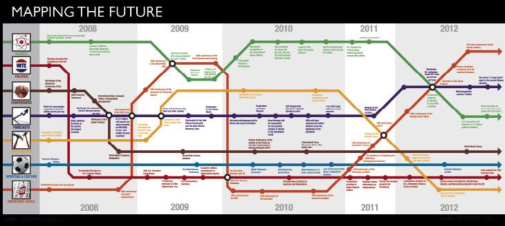
Mapping the Future, Global Strategy Institute, CSIS.
[Click here for larger image]
Mapping the Future was developed in 2007 by the Global Strategy Institute at the Center for Strategic and International Studies (CSIS). The CSIS Global Strategy Institute is dedicated to promoting long-range thinking about the big global issues that loom before us. To this end, we offer a “map of the future” for the years 2008 through 2012. No matter the outcome of the U.S. presidential elections in November, public and private sector leaders across the country (and the globe) will have to contend with certain inevitable events, unstoppable trends, and predictable developments over the next four to five years. Our goal is to paint a picture of what the landscape will look like when the new president takes office and to identify the major signposts we can anticipate. We have grouped these coming events into seven categories: science and technology; politics; major conferences; forecasts; construction; sporting and culture; and important dates.
Click on any node on the map to read more information about a particular event that the future has in store.
G-Econ Project, William Nordhaus, Yale University
The purpose of this project is develop a geophysically scaled economic data set (hence, G-Econ). The result is a global data set on economic activity for all terrestrial grid cells. As of May 2006, version G-Econ 1.3 is available, which includes 27,500 terrestrial grid cells. The G-Econ project will be a gridded data set at a 1 degree longitude by 1 degree latitude resolution. This is approximately 100 km by 100 km, which is somewhat smaller than the size of the major subnational political entities for most large countries (e.g., states in the United States, Länder in Germany, or oblasts in Russia) and approximately the same size as the second level political entities in most countries (e.g., counties in the United States). The main effort of this research is to create data on gross cell product. In addition, we have merged the economic data with other important demographic and geophysical data such as climate, physical attributes, location indicators, population, and luminosity.
Individual country files and economic contour map
Global views [N.B. large video files]
- A pixeled contour globe
- A smoothed economic globe
- A smoothed economic globe from the south
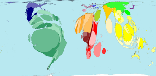
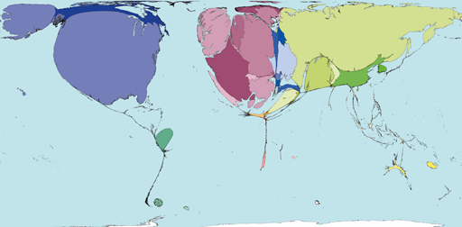
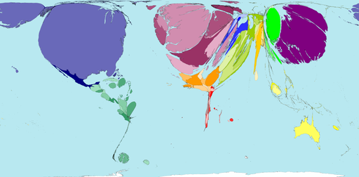
Worldmapper: the world as you’ve never seen it before, Social and Spatial Inequalities Research Group, University of Sheffield and Mark Newman, University of Michigan.
Examples:
Plants At Risk, Map No. 271, Worldmapper
Arms Exports, Map No. 281, Worldmapper
Forest Loss and Wood And Paper Imports: The top map below shows the proportion of worldwide net forest loss that occurred in countries between 1990 and 2000. The lower map shows the proportion of worldwide net imports of wood and paper in U.S. dollars. Deforestation accounts for 25 percent of global carbon emissions.
Forest Loss, Map No. 108, Worldmapper
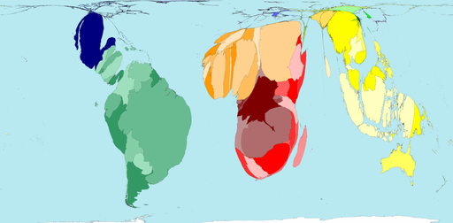
Wood And Paper Imports, Map No. 74, Worldmapper
Worldmapper is a collection of world maps, using equal area cartograms where territories are re-sized on each map according to a particular variable. Population is just one variable. Every map is of a different variable, and the sizes of each territory are in proportion to the value of that particular variable.
Why use cartograms?
Cartograms allow you to plot an isolated variable. The map on the left shows land area, nothing else. The one on the right shows population, nothing else. Select another map on this site using Thumbnail Index or Map Categories. Does it look similar to the Land Area or Population cartograms or is it a totally different world view. The thumbnail maps in the Map Index allow quick comparisons.In order to make it easier see what a these cartograms are showing, we try to preserve the shapes of individual territories, and keep them adjacent to adjacent territories and sea. The sea is always the same proportion of the map and gives the cartogram shape. (Antarctica is treated as sea.) In a sense the maps are all to the same scale, and every map is comparable with any other however the data was measured. Every map shows the worldwide distribution of something, called a variable. If a particular country is larger on one map than another, it follows that it has a higher proportion of the world total of the first variable.
Identifying territories
On the labelled territory map the names of all but the smallest territories appear as you hover over them. The colour and shade for each territory is the same on every map. As far as possible, the territory shape and relative positions are also preserved. The data files give the values for every territory listed by region, and the PDF posters often have the top ten territories.More than data
Values for 200 territories are used to create the maps. That number of figures is far too big to be able to take in at a glance. However the brain’s visual processing skills are phenomenal, and presented as a picture you have no difficulty with that number. Before you look at a particular map, you usually have some ideas about the subject. Some of those ideas may be confirmed, other things may surprise you. You, not the cartographer, not the statistician, decide what is most striking about the figures.
EarthWise: A New Landscape of Globalization, Jared Lang, Social and Spatial Inequalities Research Group.
In this Atlas, the research group developed an entirely new space of relationships. We used the raw connection values to develop a space which depends entirely on connection. Essentially, we disregarded absolute geography to create a world in which strength of connection solely determines spatial location. Peter Taylor calls this the new “Landscape of Globalization.
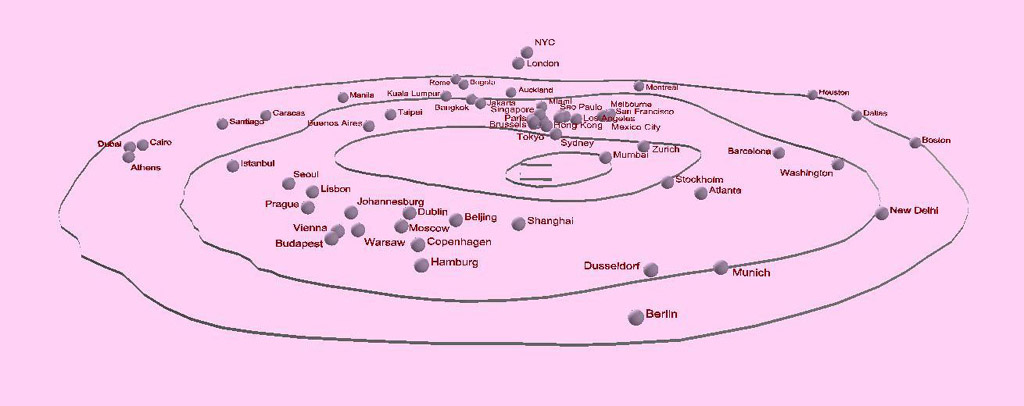
The visualizations show a new world geography based on connectivity. Cities closest to the center are the best connected to the other world cities, and cities on the edges are least connected. The points shown in the visualization are the new relative city locations based solely on connectivity values. Considering that connectivity is the only thing that matters, this is a new map of the world. The higher a city’s z-value and the closer it is to the center, the stronger its world city connection.
Debategraph, Peter Baldwin and David Price
Our goal is to make the best arguments on all sides of any debate freely available to all and continuously open to challenge and improvement by all. A controversial issue such as the debate about the future of Iraq will typically result in a vast quantity of debate material in the media, legislative bodies and academia. Much of this is highly partisan, with selective and often fallacious use of arguments and a tendency to ignore or deprecate anything that might favor contrary viewpoints. The multitude of debate contributions also exhibits a high degree of repetition and redundancy; making it harder to separate the signal from the noise. What is lacking is a method for people to easily view and comprehend the debate as a totality, with different positions and arguments clearly juxtaposed in a consistent structure that reflects sound argumentation principles. Debategraph is designed to address this deficiency by allowing protagonists for different viewpoints to collaborate in developing comprehensive statements of debates.
In pursuit of this goal, Debategraph is:
(1) A wiki debate visualization tool that lets you:
- present the strongest case on any debate that matters to you;
- openly engage the opposing arguments;
- create and reshape debates, make new points, rate and filter the arguments;
- monitor the evolution of debates via RSS feeds; and,
- share and reuse the debates on and offline;
(2) A web-based, creative commons project to increase the transparency and rigor of public debate everywhere—by making the collective insight and intelligence of the global community freely available to all.
- Every debate map is provisional and open to iterative improvement by anyone who participates.
- Over time, the debate maps will mature into the definitive articulations of each debate.
- Every change you make—whether correcting a text, adding a new argument, or starting a new debate—contributes towards the fulfilment of this social promise.
- So be bold as a first time visitor—and safe in the knowledge that a full editing history provides a safety net. And if you are interested in playing a more systematic editorial role in the community, we would love to hear from you.
(3) A global map of all the debates that enables us to visualise and deepen our understanding of the ways in which different debates are semantically interrelated, and ways in which these interrelated debates shape, and are shaped by, each other.
Debategraph – climate change (sample screenshot)
Click for large image
See also: Sense-making and mind-mapping tools

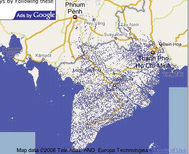
Flood Maps, Alex Tingle, NASA and Google Maps
Mekong delta, 1 metre sea-level rise
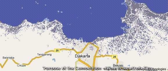
Jakarta bay, 1 metre sea-level rise
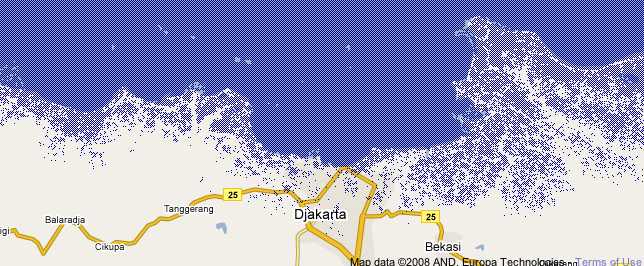
Jakarta bay, 2 metre sea-level rise
International Networks Archive, Princeton University
The purpose of the Archive is to assemble data sets relevant to empirical research on mapping the global web in a central location and to standardize them so the various indicators can be combined. Given the immense amount of work that defining a global web involves we argue for disseminating the raw data as widely as possible so as to recruit the largest possible number of collaborators.
Specific project components include:
* Collecting various network data sets (e.g. communication, trade, tourism, policy issues, migration)
* Establishing a uniform format for these so that they can be combined in models
* Making data publicly available on our Website
See also: Network analysis
Mapping Globalization Project, Princeton University and the University of Washington
- Maps – Geographical perspectives on globalization
- Narratives – Historical perspectives with animation
- Data and Analysis – Datasets, reports, and studies
NetMap Studies of World Trade, Miguel Centeno, Abigail Cooke, and Sara Curran,
“NetMap Combined Studies.” Princeton University and University of Washington, January 2006.
As part of the Mapping Globalization Project, we have explored ways to visualize international trade as a network. Network maps can often seem like nothing more than random lines, but using the technology developed by NetMap Analytics, we have developed some techniques for exploring contemporary trade visually. This page provides an interface for navigating a large number of NetMap trade studies.
The TouchGraph Google Browser reveals the network of connectivity between websites, as reported by Google’s database of related sites.
Mapping vulnerability to multiple stressors: climate change and globalization in India, Karen O’Briena, Robin Leichenko, Ulka Kelkar, Henry Venema, Guro Aandahl, Heather Tompkins, Akram Javed, Suruchi Bhadwal, Stephan Barg, Lynn Nygaard, Jennifer West, Global Environmental Change 14 (2004) 303–313.
Using the example of Indian agriculture, this paper presents a methodology for investigating regional vulnerability to climate change in combination with other global stressors. Our approach comprises four main steps: (1) developing a national vulnerability profile for climate change at the district level; (2) developing a national vulnerability profile for an additional stressor at the district level; (3) superimposing the profiles to identify districts in India that are ‘‘double exposed’’; and (4) conducting case studies in selected districts. This method may be used to assess differential vulnerability for any particular sector within a nation or region, and it can serve as a basis for targeting policy interventions.
Visualization Lab – Many Eyes, New York Times and IBM
Many Eyes is a new tool created by IBM Research that allows users to create visual representations of data and information, like charts, maps and other graphic presentations. This version of Many Eyes, known as Visualization Lab, is specifically designed for The New York Times. With Visualization Lab, NYTimes.com users will be able to visualize and comment on information and data sets presented by Times editors, share those visualizations with others and create topic hubs where people can discuss specific subjects. There is also a separate site, Many Eyes, run by IBM Research at http://services.alphaworks.ibm.com/manyeyes/.
Analysis
Experimental Visualization of Networks: world problems, international organizations, global strategies and human values (Draft), Anthony Judge, 8 September 2007.
Complementary Knowledge Analysis / Mapping Process, April 2006, Proposal for Dropping Knowledge Event (Berlin, 9 September 2006) by Anthony Judge and Nadia McLaren. Also published in modified form in Statistics, Visualizations and Patterns (Vol 5 of the Yearbook of International Organizations, Munich, K G Saur Verlag, 6th edition, 2006/2007, as section 10.1.3).